
Choosing Quilting Fabric – Which Colours for Your Quilting Project? – And 20% Off from Dropcloth Samplers!
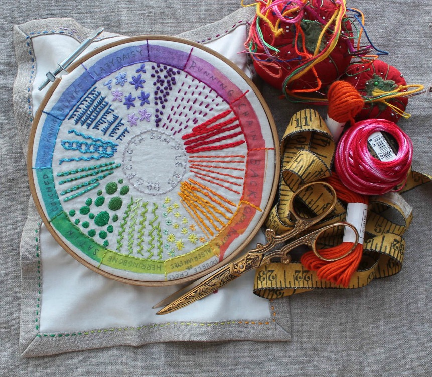
Hello fellow Thread Heads! Right! So how beautiful is this embroidered colour wheel? This bit of eye candy is the creation of lovely, talented Rebecca Ringquist, American owner and designer of Dropcloth Samplers. You can purchase her unbelievably gorgeous embroidery patterns from her e-shop. And how cool is this? She is offering us 20% off for the month of April when you use the THREADHEAD discount coupon at checkout!
Nice one, Rebecca! What a handy reference for stitches and … colour schemes! Yup, colour wheels can be such a handy tool for choosing a colour scheme for your quilting project.
To make the quilt top, you have pretty much limitless options for how you select your fabrics and the colours for the quilt.
You may decide on upcycling old skirts, dresses, bed linens, etc. to make something unique and earth-friendly. Another option is to use up bits and pieces of favourite fabric cut-offs from your stash to make a beautiful scrappy quilt.
If scrappy isn’t your thing, and you want to make a quilt that will compliment a specific colour scheme, then you’ll want to select colours based on the colour wheel. Some people have an eye for making colour choices that work each and every time. Many sewists use the colour wheel to help them to pull together colours that are just right for the space where the quilt will be used.
If you are a beginner quilter, then you may not feel completely confident to make colour decisions just yet.
Fear not, newbies! Let me walk you through Colour Theory 101!
Start by thinking about the ‘mood’ you want to create with your quilt … something calming or something uplifting, something bold or something subtle. The choice is yours!
Oh! And once you’ve mastered the use of the colour wheel, you can apply it to all of your sewing projects, decorating, garden planning, flower arranging, knitting, embroidery, anything to do with colour!
Introducing the colour wheel!
The colour wheel was originally designed by Sir Isaac Newton and some 350 years later, we still use this theory for selecting colour schemes.
The colour wheel is made up of the primary, secondary and tertiary colours. The primary colours are red, yellow and blue. Secondary colours are green, orange and purple and they are created by mixing two primary colours together. When you mix primary and secondary colours together, you get the tertiary colours. Think magenta, aqua and the like.
The neutrals of black, white and grey are not included in a colour wheel, but will create tints, tones and shades of the when added to colours from the colour wheel.
Colours on the wheel are separated into one of two temperatures. Warm colours are the reds, oranges and yellows and they may be too powerful to make a large bed quilt for a smallish room. For a smaller wall hanging quilt in a larger living room, warm colours may really work well. The cool colours of blues, purples and greens are said to make a room feel more relaxed.

Now that you know what a colour wheel is, let’s talk about how you use it!
The basics of colour schemes: Try using scraps from your stash to play around with these various schemes until you find something you like. I’ve linked examples from our Pinterest board ‘Fabulous Colour Palettes.’
- Complementary colours scheme: these are the colours that sit opposite each other on the colour wheel. Blue and orange, red and green, purple and yellow are all complementary colours. On a quilt, complementary colours are eye-popping and can look as if they are vibrating if used in bright, bold colours. It might be best to choose a dominant colour and then use the other colour as an accent. You can also choose various tints, tones and shades of the complementary colours to make a less bold statement with your quilt.
- Analogous colours scheme: these colours sit right next to each other on the wheel and are thought to be soothing and harmonious. It’s often best to have one dominant colour and two colours playing a supporting role!
- Monochromatic colours scheme: these colours use various tints, shades and tones of the same hue for a lovely calming quilt.
- Triadic colours scheme: these are 3 colours evenly spaced around the colour wheel. Just choose a favourite colour, jump over 3 colours, then land on your second colour. Skip 3 more colours and land on your third colour. These triadic colours can be very vibrant so if that’s not your thing, then choose one colour as your main colour and the other two for accents.
- Split complimentary colours scheme: this is when you choose the colour you want for your main colour in your quilt. Then you look at the complementary colour opposite and select the two colours on either side of the complementary colour as your accent colours. This is a bit less vibrant than a regular old complimentary colour scheme so a nice choice for a quilt.
- Square colours scheme: these four colours come together when you start with a colour you want to feature and then skip the next two colours on the colour wheel to land on the second colour of your four. Skip two more and then land on the third colour. Finally, skip two more colours and land on the fourth colour. If you were to draw lines from one colour to the next, they would form a square. These colours use a mix of warm and cool from the wheel and should have one dominant colour with three accent colours or else things could look somewhat chaotic!
- Rectangular colours scheme: these colours are chosen by selecting two complimentary colour schemes which if you were to draw a line connecting the colours would form a rectangle shape. So choose your favourite colour from the wheel and then skip one colour to land on your second colour. Next, skip three colours to land on your third colour. Skip one colour on the wheel again and then land on your final colour to form your rectangle. Like the Square colour scheme, you should make sure you choose one colour to dominate and the the other three as accents. Remember, too, to look for balance between warm and cool tones to keep your quilt looking evenly toned.
So just like that …bam! You’ve got your perfect combination of colours for your quilt. Thank you, Sir Isaac!
And why not stitch your own Dropcloth Sampler colour wheel for your sewing space? Thanks again, Rebecca, for the use of her stunning pic and for the generous Thread Head Fabrics discount!
Happy sewing and happy embroidering!